In the wellness world, content does more than inform it reassures. Readers often arrive with questions about their health, energy, or daily habits, and they’re looking for guidance that feels clear, calm, and credible. While strong writing lays the foundation, visual presentation plays an equally powerful role in shaping how that message is received.
Today’s readers don’t just read wellness content; they experience it. They scan pages quickly, pause on visuals that resonate, and engage more deeply with information that feels thoughtfully presented. When visuals complement the message instead of distracting from it, they help turn complex ideas into something intuitive and approachable. This is especially important in health-related topics, where clarity and trust are non-negotiable.
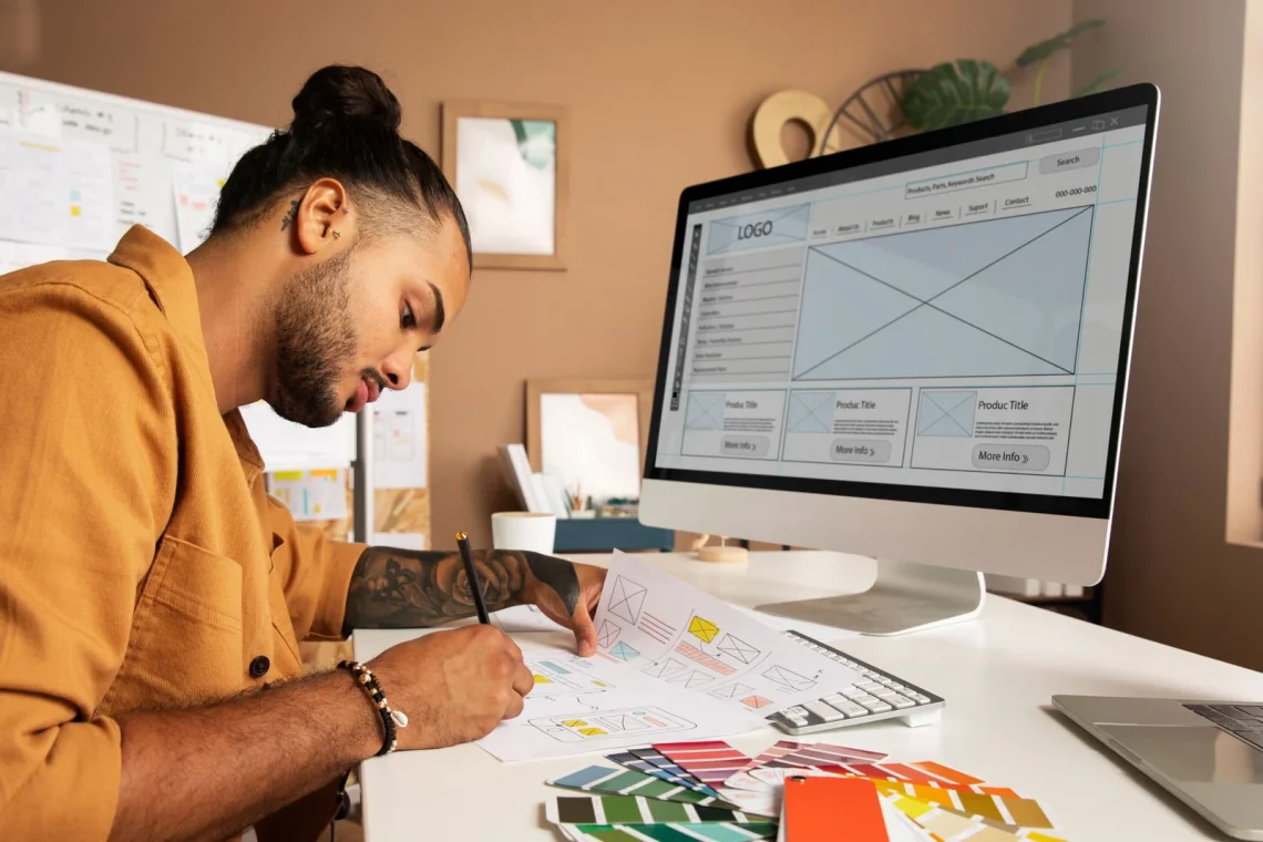
In practical terms, that means presenting information in a way that feels organized, human, and visually balanced. Tools that support collage design allow creators to combine multiple visual elements ingredients, steps, lifestyle moments, or educational highlights into a single cohesive layout that enhances understanding without overwhelming the reader.
Why Visuals Matter So Much in Wellness Content
Wellness topics are often layered and nuanced. Whether you’re discussing nutrition, natural ingredients, or daily routines, there’s usually more context involved than a quick answer can provide. Walls of text, however informative, can feel heavy especially for readers already dealing with mental or physical fatigue.
Visuals act as a bridge between information and comprehension. A well-structured visual layout can simplify explanations, highlight relationships between ideas, and guide the reader through content more smoothly. It’s not about decoration; it’s about communication.
For example, instead of listing benefits in long paragraphs, visuals can show progression, balance, or contrast. This makes the content easier to digest and more memorable.
Turning Information Into Something People Can Relate To
One of the biggest challenges in wellness writing is making abstract benefits feel real. Readers don’t just want facts they want to understand how those facts fit into their daily lives.
Visual storytelling helps create that connection. A thoughtfully arranged image layout can reflect everyday moments: preparing a routine, choosing natural options, or creating small habits that support long-term well-being. These visuals quietly answer the reader’s unspoken question: “What does this look like for me?”
When readers can picture themselves in the scenario, engagement deepens. The content stops feeling theoretical and starts feeling practical.
Consistency Builds Credibility
In wellness content, trust is built over time. Consistent visual language similar color palettes, spacing, and layout styles creates a sense of reliability. Readers may not consciously analyze these elements, but they notice when something feels cohesive.
A clean, intentional design suggests care and professionalism. On the other hand, mismatched visuals or cluttered layouts can undermine even the most well-researched content. Consistency signals that the creator values clarity and takes the subject seriously.
Think of visual consistency as the design equivalent of a calm, confident voice.
Practical Ways to Use Visual Layouts Effectively
You don’t need advanced design skills to improve how your content looks and feels. Here are realistic, actionable ways wellness creators can use visual layouts to strengthen their message:
1. Break Down Processes
If you’re explaining how something works whether it’s absorption, preparation, or a daily routine visual steps can make the explanation far clearer than text alone.
2. Support Educational Sections
Long-form articles benefit from visual pauses. Strategic visuals help readers reset their focus and stay engaged through deeper sections of content.
3. Highlight Key Concepts
Instead of repeating important points, visuals can reinforce them subtly, making the message stick without redundancy.
4. Encourage Exploration
Engaging visuals invite readers to scroll, linger, and explore more of the content rather than skimming and leaving.
The SEO Advantage of Thoughtful Visuals
Beyond reader experience, visuals contribute indirectly to search performance. Pages that keep visitors engaged longer tend to perform better in search results. When readers spend more time reading, scrolling, and interacting, it sends positive signals to search engines.
Visual content also increases shareability. Articles that look good and feel useful are more likely to be shared, bookmarked, or revisited. In the wellness space, where trust grows through repeated exposure, this matters more than quick clicks.
Altogether, strong visuals support both human engagement and long-term visibility.
Authenticity Over Perfection
A common mistake in wellness visuals is trying to look too polished. Overly staged images or generic stock photos can feel disconnected from real-life wellness experiences. Today’s audiences value authenticity more than perfection.
Natural lighting, simple compositions, and realistic environments often resonate more deeply. These choices align with wellness values balance, simplicity, and intentional living. The goal isn’t to impress; it’s to connect.
When visuals feel honest, the message behind them feels more believable.
Conclusion: Design as a Quiet Form of Communication
Great wellness content doesn’t shout it guides. Thoughtful visual storytelling helps readers understand, trust, and engage with information more easily. It transforms education into experience and supports clarity without adding noise.
By pairing strong writing with intentional design, wellness creators can communicate more effectively and build deeper relationships with their audience. When visuals and words work together seamlessly, the result is content that feels not just informative, but genuinely supportive.
Stay in touch to get more updates & news on Lyposingrass!